Understanding flex-direction in Flexbox
- CSS
I face a lot of problems when centering things in CSS. So I finally decided to learn CSS Flexbox. I started with Wes Bos's course What The Flexbox. It's a great free course, check it out if you want to learn flexbox.
Introduction
The Flexbox Layout (Flexible Box) module aims at providing a more efficient way to lay out, align and distribute space among items in a container, even when their size is unknown and/or dynamic.
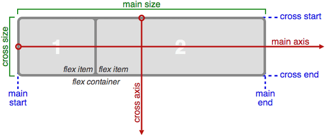
The container or parent element is called "flex container" while the children are called "flex items". In Flexbox there are two axes - Main axis and Cross axis. The flex items will be aligned along these axes.

flex-direction
The default direction of the main-axis is from left to right while the direction of cross-axis is from top to bottom. However, this can be changed by Flexbox property flex-direction. To understand how flex-direction changes these axes we need to see some code example.
<div class="container">
    <div class="box box1">1</div>
    <div class="box box2">2</div>
    <div class="box box3">3</div>
    <div class="box box4">4</div>
    <div class="box box5">5</div>
    <div class="box box6">6</div>
    <div class="box box7">7</div>
    <div class="box box8">8</div>
  </div>
I have taken a container div (flex container) and there are 8 divs (flex items) inside it.
.container {
  display: flex;
  border: 10px solid #000000;
  flex-direction: row;
}
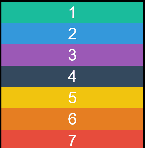
For Flexbox to work we need to set the display property of container to flex. The default flex-direction is row and it would align the flex items as below:

There are mainly four values for flex-direction - row, row-reverse, column and column-reverse.
flex-direction: row-reverse changes the direction of main-axis from left to right.

flex-direction: column changes the direction of main-axis from top to bottom.

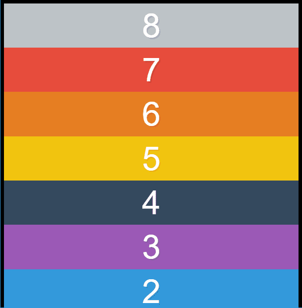
flex-direction: column-reverse changes the direction of main-axis from bottom to top.

This is it for today's post. I will continue to share about Flexbox in my future posts.