Difference between align-items and align-content in Flexbox
- CSS
In my last post, I discussed justify-content. Today, I will talk about the difference between align-items and align-content.
Below, I have some divs (flex-items) inside a container div (flex-container) in an HTML document. The CSS style is also given below.
<div class="container">
    <div class="box box1">1</div>
    <div class="box box2">2</div>
    <div class="box box3">3</div>
    <div class="box box4">4</div>
    <div class="box box5">5</div>
    <div class="box box6">6</div>
</div>
.box {
  color: white;
  font-size: 100px;
  text-align: center;
  text-shadow: 4px 4px 0 rgba(0, 0, 0, 0.1);
  padding: 10px;
}

/* Colours for each box */
.box1 {
  background: #1abc9c;
}
.box2 {
  background: #3498db;
}
.box3 {
  background: #9b59b6;
}
.box4 {
  background: #34495e;
}
.box5 {
  background: #f1c40f;
}
.box6 {
  background: #e67e22;
}

.container {
  display: flex;
  border: 10px solid #000000;
}

align-items
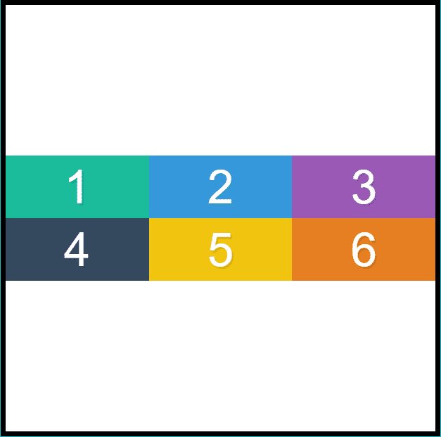
align-items is used to align flex-items along the cross axis in a flex-container. The default direction of cross-axis is from top to bottom. You must be thinking that to center the flex-items vertically we can set align-items to center and you are right but there is a catch! Let us find it out by setting align-items to center and see the output.
.container {
  display: flex;
  border: 10px solid #000000;
  align-items: center;
}
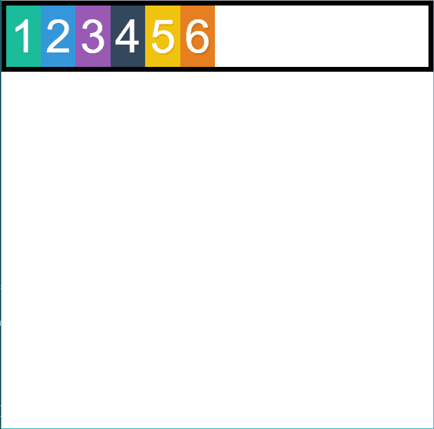
What is wrong with the output? It should have been vertically centered but it is not. Why? The answer to this question is hidden in the definition of align-items. It aligns the flex-items along cross-axis but only inside its flex-container. The black border shows us the height of the container, which is same as the height of flex-items. That is why we see no change. Let's change the height of the container and see what happens.
.container {
  display: flex;
  border: 10px solid #000000;
  align-items: center;
  height: 100vh;
}
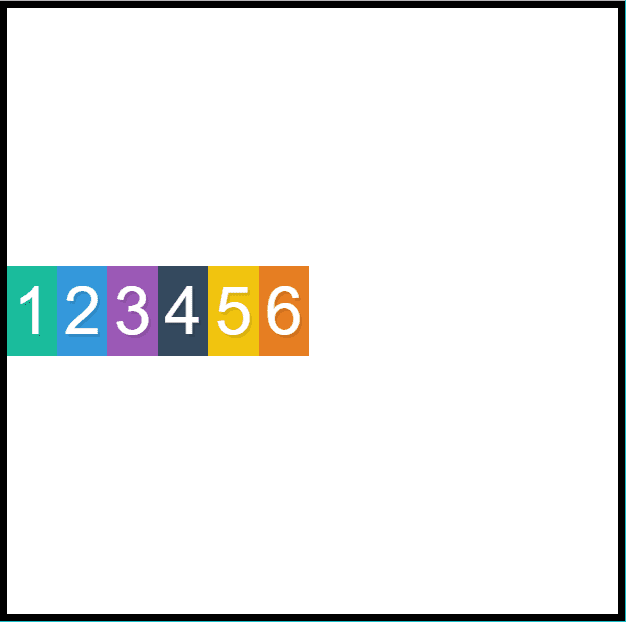
Now that align-items: center is working, let us try other values of align-items. The other possible values of align-items are flex-start, flex-end, stretch, and baseline.
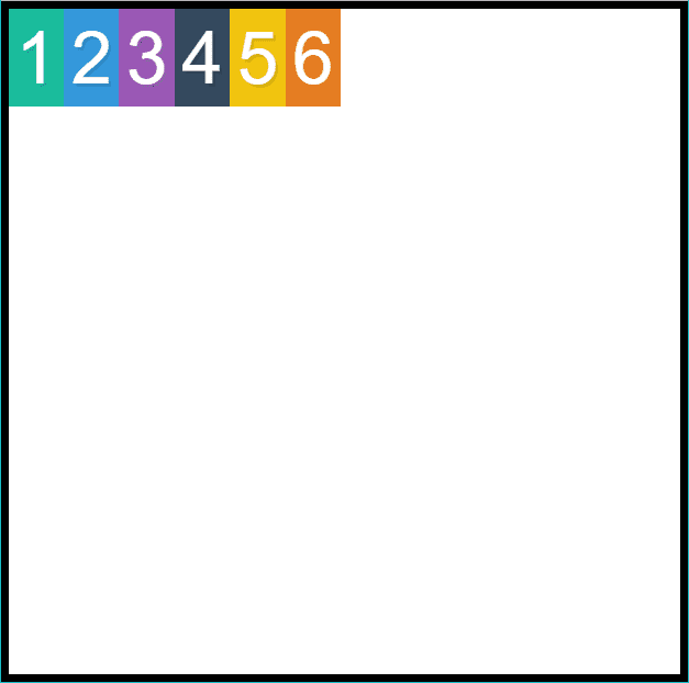
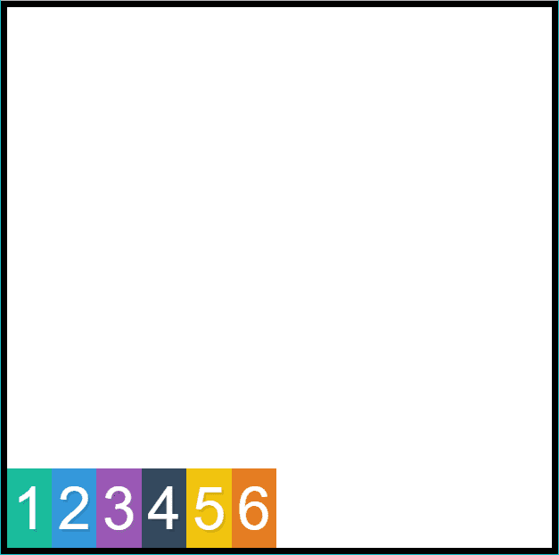
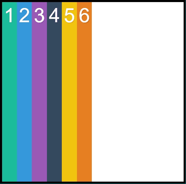
Setting align-items to stretch will stretch all the flex-items to take the full height of container. It is also the default value for align-items. The output can be seen below:
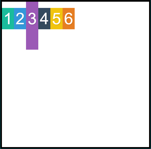
To explain baseline, I am changing height and padding of box 3.
.box3 {
  padding-top: 50px;
  height: 300px;
}
In baseline, flex-items are algined as their baselines align as seen below:
align-content
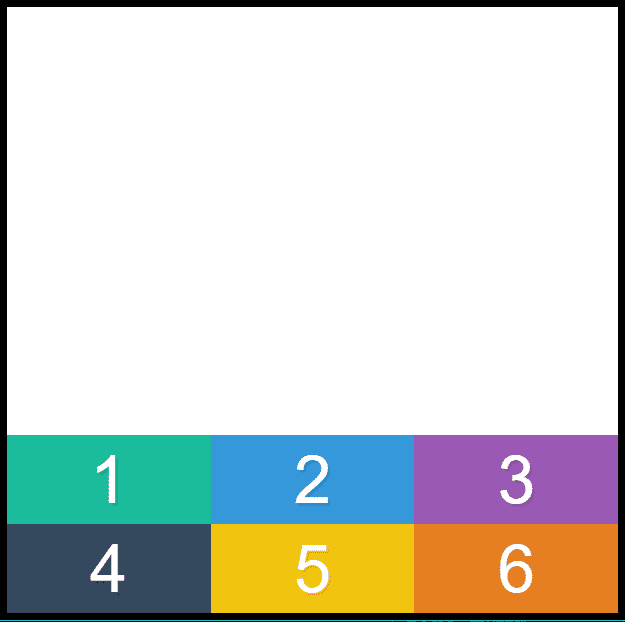
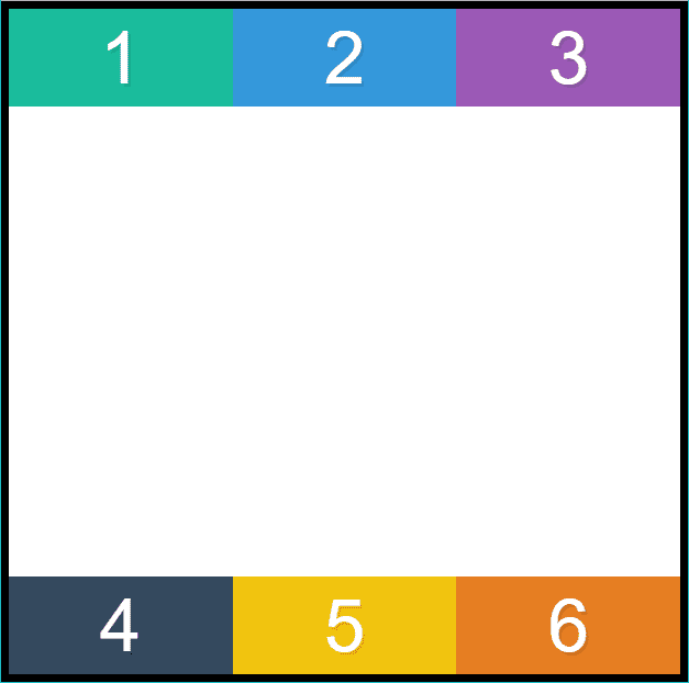
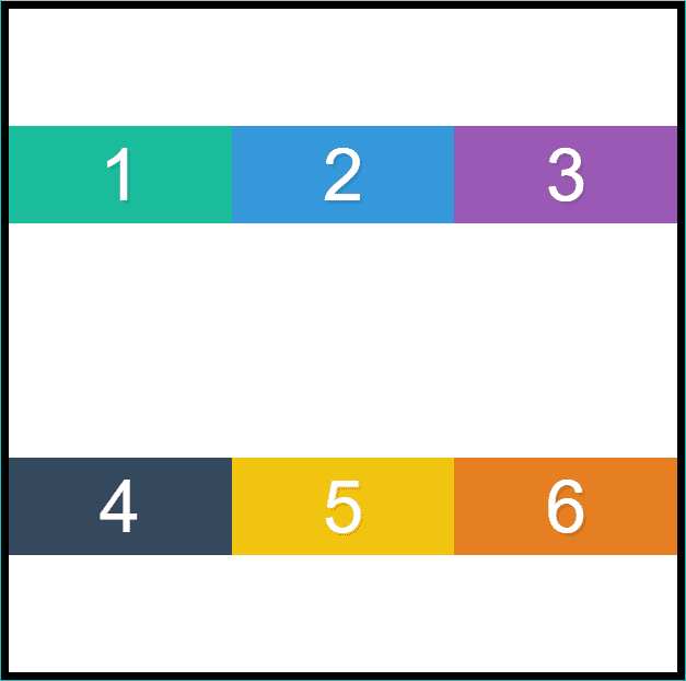
align-content is a bit tricky. First of all, it only works for multiline flex-items. So, we will have to wrap the flex-items. align-content deals with the extra space along cross-axis just like justify-content does for main-axis. First, let us make the necessary changes in CSS to understand align-content.
.container {
  display: flex;
  border: 10px solid #000000;
  height: 100vh;
  flex-wrap: wrap;
}

.box {
  width: 33.333%;
}
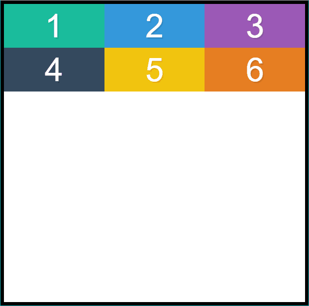
The default value of align-content is stretch which stretches flex-items to take full space of the flex-container. In the output below, each row is taking 50% of total container height because there are two rows.

This is all about align-items and align-content in Flexbox. Thanks for reading!